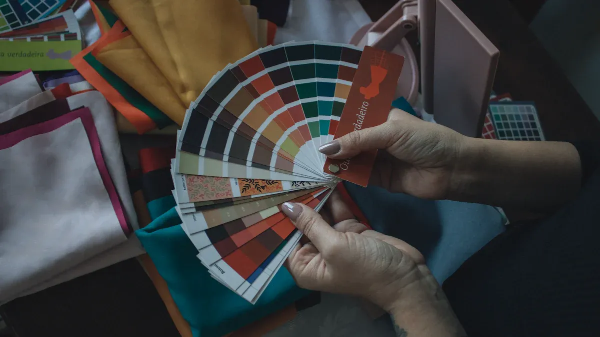
The color wheel is your best friend when it comes to creating stylish outfits. It helps you mix and match colors effectively, ensuring your look is both harmonious and eye-catching. By understanding color theory in fashion, you can explore different schemes like analogous and complementary colors. This knowledge not only enhances your outfit choices but also boosts your confidence. So, let’s dive into how you can use the color wheel to elevate your fashion game!
Key Takeaways
The color wheel is essential for pairing colors effectively in your outfits.
Complementary colors create vibrant looks, while analogous colors provide a calming effect.
Start with accessories in analogous colors to build confidence in mixing shades.
Incorporate neutral pieces to balance bold colors and maintain harmony.
Limit your color palette to 2-3 colors for a clean and stylish appearance.
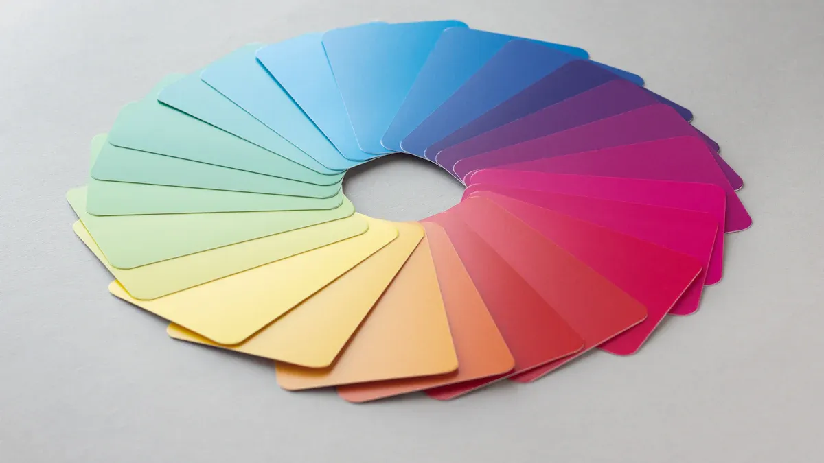
Color Wheel Basics
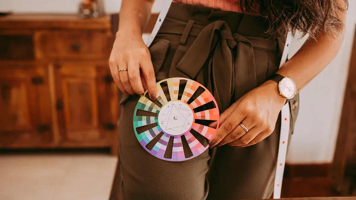
Understanding the color wheel is essential for anyone looking to enhance their fashion sense. It helps you see how colors relate to one another, making it easier to create stylish outfits. Let’s break down the different types of colors you’ll encounter.
Primary Colors
The primary colors are red, yellow, and blue. These colors are the foundation of the color wheel. You can’t mix other colors to create them, but you can combine them to form new shades. For example, mixing red and yellow gives you orange, which leads us to the next category.
Secondary Colors
Secondary colors emerge when you blend two primary colors. The combinations are straightforward:
Red + Yellow = Orange
Yellow + Blue = Green
Blue + Red = Purple
These colors add vibrancy and contrast to your outfits. They can help you create eye-catching looks that stand out.
Tertiary Colors
Tertiary colors are a bit more complex. They form when you mix a primary color with a secondary color. This combination results in shades like red-orange or blue-green. Tertiary colors add depth and complexity to your wardrobe, allowing for more creative outfit choices.
The color wheel is not just a tool; it’s a guide for your fashion journey. It helps you understand how colors interact, which is crucial for creating visually appealing outfits. By using the color wheel, you can choose colors that complement each other, ensuring your style is always on point.
Here’s a quick overview of how these colors interact:
Color Type | Description |
|---|---|
Primary Colors | Red, yellow, and blue are the core colors, unmixable from others, forming the foundation for all other colors. |
Secondary Colors | Green, orange, and purple emerge from blending two primary colors, adding vibrancy and contrast. |
Tertiary Colors | Created by combining a primary and a secondary color, these shades add complexity to a palette. |
Using the color wheel effectively can transform your wardrobe. Start with a dominant color, then explore complementary, analogous, or triadic colors to create stunning outfits.
Color Harmonies in Fashion
Complementary Colors
Complementary colors sit opposite each other on the color wheel. They create a striking contrast that can elevate your outfit. For instance, pairing red with green or blue with orange can make your look pop. Here are some popular complementary color combinations you might consider:
Red and Green
Blue and Orange
Coral and Blue
Using complementary colors in your outfits can enhance their visual appeal. However, be mindful of how you apply these colors. Too much contrast can overwhelm your look. Designers often use complementary colors as accents to achieve a balanced appearance. This approach allows you to stand out without going overboard.
Analogous Colors
Analogous colors are those that sit next to each other on the color wheel. This color scheme fosters a sense of cohesion and unity in your outfits. For example, if you choose shades of blue, teal, and green, you create a calming effect that’s visually pleasing. This technique works wonders in product photography, as it enhances the overall aesthetic. When you wear analogous colors, you can effortlessly create a harmonious look that feels put together.
Triadic Colors
Triadic color schemes involve three colors that are evenly spaced around the color wheel. This approach offers a high level of contrast while maintaining harmony. For example, you could combine mustard yellow, vivid red, and deep blue for a vibrant outfit. Alternatively, you might opt for softer tones like yellow-orange, washed blue, and earthy red for a more sophisticated look. Triadic schemes allow each color to complement the others, preventing any single hue from dominating your ensemble.
Incorporating these color schemes into your wardrobe can help you create balanced and visually appealing outfits. Experiment with different combinations to find what resonates with your personal style!
Using the Color Wheel for Outfits
Tips for Outfit Matching
When it comes to matching colors, the color wheel is your go-to guide. Here are some effective strategies to help you create stunning outfits:
Classic Contrast Combinations: Pair shades like red with green or blue with orange. Make one color dominant (about 70%) and the other complementary (30%). This balance creates a striking look.
Soft Color Combination: Use soft colors mixed with gray or pastel shades. This approach gives you a calm and relaxed vibe. Think light with light or dark with dark for a cohesive outfit.
Neutral Colors Look: Focus on neutral shades like white, beige, and gray. These colors match easily, but add unique designs or textures to keep your outfit from feeling dull.
Mix of Neutral and Complementary: Combine neutral colors with bright or soft colors. Ensure cold neutrals match with cold shades and warm neutrals with warm shades. This balance creates harmony in your ensemble.
Tip: Limit your color palette to 2–3 colors per outfit. This keeps your look clean and stylish.
Real-Life Examples
Let’s look at some popular color combinations that fashion experts recommend. These examples show how to apply the color wheel in everyday outfits:
Color Combination | Description |
|---|---|
Black and White | An enduring style legacy, perfect for any occasion. |
Beige and Wine | Combines rich tones and neutrals, ideal for fall with an elegant touch. |
Blue and Blush Pink | A classic pairing that balances bold feminine energy, suitable for various occasions. |
Orange and Purple | A bold declaration of color, trending in 2025 fashion. |
Green and Blue | A harmonious duo inspired by nature, perfect for smart casual outfits. |
Fuchsia and Red | A striking combination that commands attention, ideal for making a fashion statement. |
Mint and Lavender | A soft pastel pairing that conveys calmness and grace, perfect for summer wear. |
Powder Blue and White | A fresh combination that complements every skin tone, trending for office wear in 2025 fashion. |
By experimenting with these combinations, you can find the perfect color combination that reflects your personal style. Remember, the key is to have fun and express yourself through your outfits!
Common Mistakes in Color Matching
Overusing Colors
One of the biggest mistakes you can make when matching colors is overusing them. It’s easy to get excited about vibrant hues and want to wear them all at once. However, this can lead to an overwhelming look. Think of accent colors as spices in a dish—they enhance the flavor but shouldn’t overpower it. Overusing bright colors can make your outfit feel chaotic or unbalanced.
To avoid this mistake, limit your color palette to a maximum of three colors. This keeps your look clean and stylish. For example, you might wear a navy suit with a burnt orange pocket square. This combination uses a neutral base with a pop of color, creating a balanced and eye-catching outfit.
Ignoring Neutrals
Another common error is ignoring neutral colors. Neutrals like white, beige, gray, and black are essential for mixing and matching with bright colors. They help tone down the vibrancy of bold pieces, ensuring that these colors remain the focal point of your outfit. Here are some reasons why you should embrace neutrals:
They provide a solid foundation for any outfit.
They allow you to experiment with brighter colors without overwhelming your look.
Incorporating neutral-toned shoes can further balance a brightly colored outfit.
By using neutrals wisely, you can create outfits that feel cohesive and stylish. For instance, pairing grey trousers with a white t-shirt and a vibrant emerald green blazer creates a striking yet balanced look.
Misunderstanding Color Harmonies
Misunderstanding color harmonies can also lead to mismatched outfits. Each color scheme has its own vibe, and knowing how to use them can elevate your style. Here are some common color harmonies to consider:
Formula Name | Description | Example Outfit |
|---|---|---|
Neutral + Pop | A foundational outfit of neutrals with one strong accent color. | Grey trousers, a white t-shirt, and a vibrant emerald green blazer. |
Monochromatic | Using different shades of a single color for a cohesive look. | Navy blue chinos with a lighter blue shirt and a sky-blue sweater. |
Analogous Harmony | Pairing colors next to each other on the color wheel for a blended look. | An olive green jacket over a forest green top with dark green trousers. |
Complementary Punch | Using opposite colors on the color wheel for a bold statement. | A navy suit with a burnt orange pocket square. |
Understanding these harmonies helps you create outfits that feel intentional and stylish. Experiment with different combinations to find what works best for you.
Tip: Always take a moment to assess your outfit before heading out. Ask yourself if the colors work together harmoniously. If not, don’t hesitate to make adjustments!
By avoiding these common mistakes, you can master the art of color matching and enhance your personal style. Remember, color theory in fashion is all about expressing yourself while maintaining balance and harmony in your outfits.
Incorporating the color wheel into your fashion choices can truly elevate your style. Here are some key takeaways to remember:
Understanding the color wheel helps you pair colors effectively for outfits.
Complementary colors create vibrant combinations, while analogous colors offer a soothing look.
Starting with accessories in analogous colors can ease you into more complex combinations.
Don’t forget to use neutral pieces to balance bold choices.
Experimenting with different colors can help you discover what makes you feel confident and stylish. Remember, the colors you wear communicate who you are and how you wish to feel. So, embrace your personal style and have fun mixing and matching!